Sunday, March 8, 2015

The Science of Peak Oil

One of the many barbs often pointed at peak oil proponents is that they are constantly shifting the goal posts. Peak oilers are accused of changing the definition of what peak oil actually means, therefore the entire concept of oil production peaking is rubbish. Far from a valid criticism however, this is actually a scientific virtue. If any scientist dogmatically stuck with a rigid theory as the data repeatedly proved that theory to be incorrect then that would be cause for great concern. The fact however that peak oil theory has developed markedly since Hubbert Peak Theory in 1956 shows that peak oil proponents are willing to listen to the data and change accordingly. This is the basis for the entire scientific method: form a question, create a hypothesis, test the hypothesis, analyse the results and alter the hypothesis if required and then test again. This is the most successful framework that humanity has developed so far in order to further human scientific knowledge.

The core logic of science is simple: testing ideas with evidence. It is also worth noting that science is not static. It is constantly evolving. As the University of California, Berkley’s Understanding Science website states:

“...scientific conclusions are always revisable if warranted by the evidence. Scientific investigations are often ongoing, raising new questions even as old ones are answered.”

As the above quite makes quite clear, the “shifting goalposts” argument (commonly from economists) misunderstands how science works. Again from the University of California, Berkley’s Understanding Science website:

“The knowledge that is built by science is always open to question and revision. No scientific idea is ever once-and-for-all "proved." Why not? Well, science is constantly seeking new evidence, which could reveal problems with our current understandings. Ideas that we fully accept today may be rejected or modified in light of new evidence discovered tomorrow.”

This is exactly what has happened with peak oil. Hubbert Peak Theory works and has been proven with a number of natural resources such as coal and natural gas, not just with crude oil. There are of course also many instances where it doesn’t fit neatly and these are the areas we need to investigate further and understand why they act differently. This does not disprove the overall Hubbert Peak Theory in anyway.

That much of the criticism of peak oil comes from those working in economic fields is not altogether surprising. Economics is not called the “dismal science” for nothing. Historically economics has tended to be lead by blind ideology rather than evidence based research. Thomas Piketty’s Capital in the 21st Century has in part been so groundbreaking because it has used a plethora of evidence to refute many of the claims made by mainstream economists over the last 50 years. Many of the rebuttals against Piketty have misconstrued his arguments leading to Piketty going so far as to accuse the Financial Times of “dishonest criticism.” The “dishonest criticism” accusation could be made against many of the peak oil deniers as well.

A great example of how science builds on the work of past researchers and evolves over time comes from the field of atomic theory. Ernest Rutherford was first to postulate the structure of an atom. When he published his results his findings were widely scrutinized by the scientific community. Niels Bohr noticed a problem with Rutherford’s idea: it couldn’t explain why the orbiting electrons didn’t fall in towards the nucleus and collapse the whole atom. Bohr altered Rutherford’s initial model and proposed that electrons had set energy levels. Bohr had solved the problem and went on to win a Nobel Prize for his work. Many scientists have then built on and modified the Rutherford-Bohr model over the past 100 years. If we used the logic of peak oil deniers however, Rutherford should be admonished for getting it wrong in the first place and every scientist that has worked on atomic theory since should be treated with smug contempt for working in a “disproven field.”

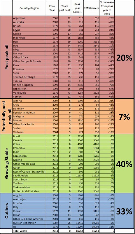
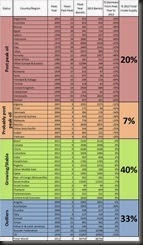
We might also ask how so many intelligent, worldly people can be so blind to the multitudes of evidence that support the idea of peak oil. There are a number of examples from history where science got it blindingly wrong until good, solid evidence provided a paradigm shift. In the field of astronomy we have the battle of ideas between Copernicus and Ptolemy. Copernicus published his heliocentric model in 1543. For almost 1400 years before that humanity believed Ptolemy’s theory that the earth was the center of the universe. Peak oil deniers are the equivalent of Ptolemy’s supporters, refusing to acknowledge the data that consistently proves them wrong. It’s no coincidence that many peak oil take-downs are heavy on rhetoric and light on data. How else could you argue that peak oil doesn’t exist when presented with data such as in Figure 1?
clip_image002

Figure 1: Countries/regions past peak oil, probably past peak oil, growing/stable and outliers. Data from BP Statistical Review of World Energy 2014.

Another example of a paradigm shift comes from the field of medical science. Until Louis Pasteur published his research on germ theory in the 1860s hand washing was almost non-existent for the majority of the population, including medical staff. Up until then doctors tended to attribute infections to “bad air” and blamed disease on imbalances of the "four humors" (blood, phlegm, yellow bile and black bile). Their blind faith in the intangible is as defensible as the blind faith of peak oil deniers arguing that technology will always save us from peak oil.

Third and finally is an example from genetics. DNA was discovered in 1869, but it wasn’t until Watson and Crick published the double-helix model in 1953 that scientists realised that DNA, not proteins were responsible for hereditary. Up until that point humanity had believed an idea that was later proven to be wrong. This is similar to the situation we are facing at the moment trying to convince society and especially those in power that peak oil is real and cheap energy will become increasingly scarce.

Hubbert Peak Theory has been tested numerous times in order to strengthen the model and point out any weaknesses. This is science in action. The influential peak oil website, The Oil Drum, is full of information testing Hubbert Peak Theory. Here is an example where Robert Rapier shows how it doesn’t work for the Texas situation. Because a model doesn’t work in one area doesn’t make it invalid per se, it just means we have to go back and find why it doesn’t fit and adjust the model and try again.

clip_image004

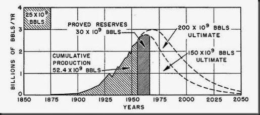
Figure 2: Ultimate United States crude oil production based on assumed initial reserves of 150 and 200 billion barrels. Figure 21 from M. King Hubbert’s Nuclear Energy and the Fossil Fuels, 1956.

Where Hubbert did prove to be extremely accurate was in his prediction of United States crude oil production. In his seminal 1956 paper M. King Hubbert predicted the peak in crude oil production for “about 1970” based on initial reserves of 200 billion barrels (Figure 2).
clip_image006

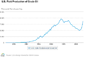
Figure 3: United States Field Production of Crude Oil (Y scale is missing 1 from 10,000 and 12,500 due to EIA website glitch). From EIA.

The actual data shows he was extremely accurate. Figure 3 shows crude oil production peaked at 9,637 thousand barrels per day in 1970. Production then declined to a bottom of 5,000 thousand barrels per day in 2008 after which it climbed again astronomically with the shale oil revolution. It is worth noting that Hubbert did not include shale oil and tar sands in his 1956 analysis even though he did acknowledge their existence:

“Production of the world’s coal has already consumed about 3.7 percent of the minable reserves initially present, that of oil and gas about 7 percent, while the production from shale and tar sands has barely been started.”
clip_image008

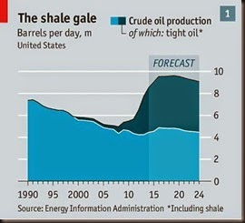
Figure 4: Forecast of United States Production of Crude Oil. From The Economist, 2014.

With the value of hindsight we now know how much of a game changer tight oil has been. We can see from Figure 4 that conventional crude (the oil production that Hubbert was forecasting) is predicted by the EIA to plateau and then continue declining. Tight oil, which Hubbert did not include in his 1956 analysis, makes up the bulk of the increase in United States crude oil production.
clip_image010

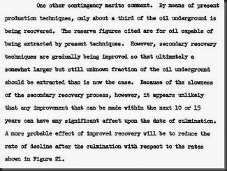
Figure 5: Hubbert on proved reserves. From Nuclear Energy and the Fossil Fuels, 1956.

Hubbert also acknowledged that only one third of oil was being extracted at the time of his analysis (Figure 5). The reserve figure he used for his peak oil prediction were using the proved reserves figure ie oil that can be extracted under current economic conditions with current technology. Tight oil and tar sands extraction technology barely existed in 1956 and only became widely used in the late 2000s.
clip_image012

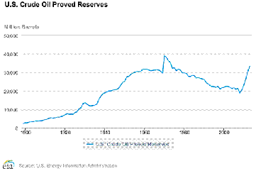
Figure 6: United States Crude Oil Proved Reserves. From EIA.

If we look at the US crude oil proved reserves in the mid 1950s they were around 30,000 million barrels (Figure 6). This figure jumped considerably after the price of oil rose due to the 1973 oil crisis and then proved reserves gradually declined. It was only after the 2008 global financial crisis that record high oil prices and made shale oil economical to extract and thus we saw proved reserves rise again.

All this points to the fact that M. King Hubbert was largely correct with his predictions with the information he had on hand at the time. Where he got it wrong is cause for further investigation and an opportunity to further human knowledge. Peak oil proponents should constantly be seeking new evidence and strengthening our arguments. This is the scientific method in action. I look forward to seeing where the goal posts shift to next.
Wednesday, December 10, 2014

US Proved Reserves Set To Plummet

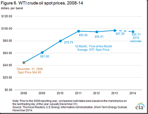
One of the big points that appears to have been largely missed over the last few weeks is that if WTI crude prices stay in the low $60 range, US proved reserves will plummet. Proved reserves over the past few years have been based on a spot price of around $95.

B4dGxYRCQAAdclD

The November 2014 average for WTI was $75 and at the time of writing WTI was sitting at $63.16.

BP explains proved reserves:

“Proved reserves of oil are generally taken to be those quantities that geological and engineering information indicates with reasonable certainty can be recovered in the future from known reservoirs under existing economic and geological conditions.”

The last time oil prices were in the $60 range was in 2009 when reserves were just 30.9 thousand million barrels, 30% lower than the 2013 figure that was last put out by the EIA. In fact the US proved reserves had been sitting around the 30 thousand million barrel mark for sixteen years until the shale boom kicked off and reserves were significantly raised in 2010 and every year after that.

If oil prices stay low the US could be in for a big shock and the mythical “energy independence” will be even further from their grasp. Now of course drilling technology has advanced greatly since 2009 and will lessen the impact. However it is also worth noting that many shale companies have yet to actually make a profit and this price drop could be enough to send investors running which will have further negative impacts.

Sunday, November 2, 2014

Peak Oil Is Happening

The media is full of peak oil refutations. Unfortunately for the pundits, while they’re heavy on rhetoric they tend to be short on data.

In comparison, way back in 2009, Praveen Ghunta, used the BP Statistical Review of World Energy to make a list of countries past peak oil on his True Cost blog. He updated the data again in 2011.

Taking Ghunta’s work as a base I have followed up with figures from the 2014 BP Statistical Review of World Energy. I have purposefully been much more conservative in in defining what a country past peak actually looks like: I have made the arbitrary decision that any country or region that peaked more than 10 years ago and produced a minimum of 10% less oil in 2013 than in the peak year has officially reached peak oil. That is of course is the point in time when the maximum rate of extraction of oil is reached, after which the rate of production is expected to enter terminal decline.  Peak oil is only visible through hindsight and so I have taken a cautious approach to assigning exactly which countries and regions are past peak. Peak oilers have long been far too quick to draw conclusions based on questionable data and so I am trying to avoid this same pitfall.

It is worth noting that terminal decline is not always inevitable as we have have seen from the stunning turn around in the United State’s production figures. How long this will actually last and how applicable the United State’s shale oil technology is to the rest of the world is yet to be seen. Too many factors play into oil production to make any strong predictions for the future.

That being said, Luisa Cipollitti an official for Statoil Venezuela recently commented that half of the world’s 163 biggest oil projects require a $120 price for crude oil. Given the current plummeting oil prices many projects could be delayed or cancelled if those prices stay low. This in turn could hurt global production in the coming years. At the time of writing Brent crude prices were sitting around $85 a barrel.

The truth is that peak oil is happening in a number of countries and regions throughout the world. It’s just happening in a way that many of the doomsday peakers never imagined. John Michael Greer appears to be correct in coining the term “the long descent.” We can expect to see periods of growth truncated by recessions which push greater and greater proportions of society to breaking point. We will also see an increasing number of countries and regions hitting peak oil. Some will decline spectacularly such as Australia, Norway and Yemen. Others will carry on for many years on an undulating plateau. Yet others still will see production gains due to new technology making olds fields viable once more. The only thing for certain is that the future will be messy.

Untitled-1

It is worth noting that a number of politically unstable countries such as Iraq and Syria and sanctioned countries such as Iran are more than likely not physically past peak. However their difficult political/conflict situations make external investment untenable for many players. It is unlikely they will stabilise enough for production to increase in the near future and so for all intents and purposes they are past peak. Including these countries and those potentially past peak, 27% the worlds production comes from countries and regions that are past peak oil.

A full 40% of countries and regions appear to to stable and/or growing. Most of these countries are relatively politically stable and so are attractive for investment. However, ongoing trouble in Nigeria has seen a pullout of some major players which has led to a lack of development of new fields and the Republic of Congo has seen a number of major fields pass peak.

The  most interesting sub-group is that which I have classed as ‘outliers.’ These countries account for 33% of 2013 production but don’t follow any discernible pattern and so need to be looked at individually.

Angola’s production has been stagnant due to persistent technical problems with some projects. Despite some new fields coming online since 2008 rapid depletions in other fields has led to steep  decline rates.

Azerbaijan’s production has suffered from unexpected technical problems at its largest fields. New projects such as the Chirag Oil Project, may boost Azerbaijan's production. Then again, it might not.

Ecuador rejoined OPEC in 2007 after leaving in 1992 due to OPEC’s high membership fees and refusal to allow Ecuador to raise production. Since then Ecuador has remained relatively unattractive to investment due to socialist government initiatives to retain a higher share of oil profits.

Italy banned offshore drill in 2010 following Deepwater Horizon and is only now beginning to allow some offshore projects. Italy first produced over 100,000 thousand barrels of crude in 1996 and has bounced along roughly 20,000 barrels either side since then.

Kuwait has struggled to boost oil and natural gas production for more than a decade due to project delays and insufficient foreign investment. A shake out of the state owned oil company was made in 2013 in order to try and address these issues.

Oman has technically difficult plays which are expensive to extract. Oman's fiscal breakeven price for oil in 2013 is $104 per barrel. DME Oman prices ranged between $101.69 and $95.28 per barrel in September 2014.

Most of the smaller Central and South American producers maintain relatively socialist governments with inflexible profit sharing arrangements. These countries therefore struggle to attract overseas investment to develop new wells.

The Russian Federation has a number of new projects in development but these are expected to only offset declining output from large aging fields. New technology is seeing better recovery rates from current fields.

Already mentioned, the United States has seen an unprecedented increase in oil production since 2008 due to a huge increase in exploration and drilling in previously unprofitable shale oil fields. It is highly debatable how long this boom will last. The latest EIA report forecasts a long, slow production decline after 2021 while the Post Carbon Institute put a report out last week predicting a peak before 2020 with production levels just one tenth of what the EIA forecasts by 2040.

Monday, April 7, 2014

Let’s Cut The Bullshit: Rodney Hide Is A Crank

We need to talk about Rodney. It won’t exactly surprise many people that Rodney Hide is full of shit. Disturbingly however his frothing climate denialism (Paid) continues to be published in the National Business Review and other media. To NBR’s credit they also published Kennedy Graham convincing rebuttal of Rodney’s most recent trash piece.

What I find so hard to comprehend is that Rodney Hide is supposedly a man of science. He has a degree in zoology and botany from the University of Canterbury as well as a degree in resource management from Lincoln. I can only assume these degrees require some kind of scientific comprehension because Hide certainly doesn’t have any. Everything we have seen from him over the years show’s us that he has absolutely no idea what he is talking about. 

Take for example a piece written by Hide back in January in the New Zealand Herald  that I was alerted to by Morgan Godfrey last week:

Untitled-1

The stupidity displayed in Hide’s piece of writing is so astounding it has led me to conclude one of three things; either Rodney Hide is a complete and utter moron, he is utterly bat shit insane or he is a sociopath who understands the science but uses his platform to manipulate and provoke people. He writes:

“Future historians may point to this one ironic event as the trigger that finally ended the public fear of global warming. The Australasian Antarctic Expedition was stuck fast over Christmas and New Year in Antarctic sea ice. In summer. The ice beat back three ice-breakers.”

This is not unusual. Boats get stuck or have to make large detours due to Antarctic sea ice almost every summer. It is true that Antarctic sea ice has been growing, although this is at almost the same pace as the Arctic has been losing ice which has led to very minor net change.

So just why is the Antarctic gaining ice? Guy Williams published a great explanation over at The Conversation in October last year. The basic points are:

  1. Sea ice is completely different to continental ice and can move considerable distances with wind and currents. This means it is very difficult to predict just where sea ice will be thickest on a year to year basis.
  2. The net increase in sea ice masks large declines in particular regions around Antarctica, such as in the Bellingshausen Sea, which are equal or greater than sea ice losses in the Arctic.
  3. No one quite knows why net Antarctic sea ice is growing but Antarctica has also lost about 100 billion tonnes of continental ice a year since 1993. It also  doesn’t preclude the fact that the decline in Arctic summer sea ice extent in 2013 was 18% below the mean from 1981-2010.

But let’s hear from Hide again, he sounds like he knows what he’s on about:

“The expedition relied on computer models, not real world reports. "That can't be sea ice, the computer says so!" And please, keep worrying: our being stuck proves global warming!”

It’s a bizarre claim to make as there is an abundance of real world reports of climate change impacting people and ecosystems going back years now. Just one example from 2008 the Solomon Times Online reported 40 Carteret Islanders were to be resettled in Bougainville, the first of the population of 1500. Sea levels around the atoll have risen 10 centimeters in the past 20 years, inundating plantations and making the islands largely inhabitable.

Hide finishes by repeating a lie:

“The world is not warming. It hasn't warmed since 1997.”

Skeptical Science refutes this one the best:

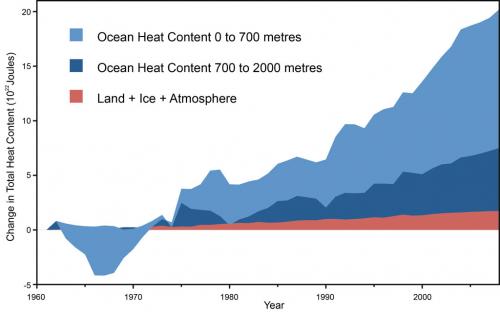
“There's also a tendency for some people just to concentrate on surface air temperatures when there are other, more useful, indicators that can give us a better idea how rapidly the world is warming. Oceans for instance -- due to their immense size and heatstoring capability (called 'thermal mass') -- tend to give a much more 'steady' indication of the warming that is happening.  Records show that the Earth has been warming at a steady rate before and since 1998 and there is no sign of it slowing any time soon (Figure 1).  More than 90% of global warming heat goes into warming the oceans, while less than 3% goes into increasing the surface air temperature.”

Fig 1

Figure 1:  Land, atmosphere, and ice heating (red), 0-700 meter ocean heat content (OHC) increase (light blue), 700-2,000 meter OHC increase (dark blue).  From Nuccitelli et al. (2012).

Free speech is a great thing but when people with a platform such as Rodney Hide use it to distribute bullshit and lies they need to be called out loudly and often. In an election year we need to drown out batshit insane moronic sociopaths such as Rodney Hide or in the not too distant future a sizeable portion of humanity will be drowning as the sea rises around them.  

Monday, February 17, 2014

Why The Green Party's Solar Panel Proposal Is Smart Policy

Yesterday the Greens announced a policy to increase the number of solar panel installations, the second stage of their highly successful home insulation policy which has been in effect since  2009.
 
Low cost government loans would be provided in order for households to install solar panels and which would then be paid back over a number of years. Details of the Greens policy can be found here.
 
The reaction from National has been negative as expected. John Key was quoted on Breakfast this morning as saying:
"If you look at the big emissions at the moment in New Zealand, it's Genesis through Huntly where they have coal fired power plants, and the plan that [the Greens] have got is going to reduce all competition and in my view, put up power costs to consumers, not reduce it, [and] actually locks that in."
Unfortunately for Key the experience overseas with home solar power has been exactly the opposite. In Western Australia (WA) solar panel installations have grown from zero to 130,000 in just five years and continue to grow at a rate of more than 2,000 a month. This has been pushed by a 70% rise in power costs from utilities since 2008.
 
The massive increase in home power generation has led to what appears to be a “death spiral” for utilities as the gap between the cost to generate, transmit and sell electricity and the end charge to consumers has widened. This has led to state owned Synergy revealing that the cost of delivering power through the grid was $500 million more than what it received from consumer bills.
 
Meridian chief executive Mark Binns said last week he "can't follow" the numbers put forward by proponents of solar power. “On our numbers, in our analysis, it is still probably not viable if you went to an accountant."
 
This is an odd statement to make from a man that runs a company that sells solar sheds to farmers as “the future of your farm.” The first benefit on their website mentions reducing your energy costs.

It could just be that Binns has seen the writing on the wall from his off siders over the Tasman and is concerned about his own companies long term viability. If the Greens solar policy rolls out over enough households it could make a very real dent in profit margins.

 
One of the major differences between Western Australia and New Zealand that could see solar having less of an impact here is sunshine hours. While most areas in New Zealand get more than 2000 sunshine hours annually, WA averages roughly 2900.
 
That being said solar still has a lot to offer in New Zealand. The government’s own Energy Efficiency and Conservation Authority (EECA) states:
“…if every New Zealand home had a 3kW photovoltaic (solar) panel array, they would collectively generate enough power in a year to satisfy over a quarter of New Zealand's annual residential electricity needs.”
As New Zealand's solar energy resource is about 4 kWh/m2 per day the potential cannot be balked at.
 
For those New Zealanders that have already gone down the solar route the benefits are telling. Nelson solar panel users have reported making a profit from feeding electricity back into the grid. As more households come onboard opportunities like this will likely dry up but it is still worth noting that real world experiences fly in the face of what industry experts like Mark Binns are saying.
 
Other real world examples include Putaruru farmers Hugh and Sue Chisholm. They have installed one of the country's largest solar powered systems ever to be used on a dairy farm and expect to see a return on investment of 12.8 per cent.
 
The Greens solar policy isn’t a magic bullet, but coupled with the home insulation programme it is another step in the right direction. National needs to stop dragging its feet and get on board with  sensible policy.

Thursday, July 4, 2013

A Call To Arms: The End Of The Oil Drum

I felt a deeply saddened by the news that The Oil Drum was to stop publishing new posts at the end of the month. The comments both on the website and on Twitter have been resoundingly positive, with many long time readers/first time posters logging on specifically to say how much they had learnt and to thank all the contributors.

The end of something familiar is always hard to take but as seems the administrators cannot be swayed it is time to look elsewhere. I personally have chosen Resilience.org which is the relatively new reincarnation of the Post Carbon Institute’s Energy Bulletin.

Why then did Energy Bulletin morph into something quite different while The Oil Drum remained relatively unchanged over the years? I think the answer is survival. Many people may cringe to hear this but success on the internet is about how well you can market your product (website). You may have great content but unless lots of people are reading it then what is the point?

I think this is where the downfall of The Oil Drum lies. It has published incredibly important work but refused to change with the times and become more relevant. Public interest in peak oil peaked at the end of 2005 with another surge of interest in the middle of 2008. And yet The Oil Drum faithfully stayed the course, publishing in depth technical articles that often showed an alternative view to the mainstream story being fed through the media.

I think though at a certain point they began preaching to the converted and needed to change gear. Readers knew their was a problem, and rather than providing solutions The Oil Drum kept outlining the same problems in different ways. If you look at Resilience.org today compared to Energy Bulletin a few years ago the main difference is a lot more stories on growing your own food, building community and transitioning to a low energy lifestyle. This is all very important stuff that people are really want to learn about.

As an ecologist I am drawn to the the conversation biology metaphor of charismatic megafauna, also commonly known as umbrella species. These are your dolphins, whales, lions, tigers and pandas that people generally love and will spend a lot of time and money trying to save. The benefit of course is that when you conserve something like wild panda habitat, all the other less attractive plants and animals in that same area are also protected by association. While snails, cockroaches and rats are all ecologically important they would never gain as much attention as a panda. The main reason why The Oil Drum steadily lost readers is that its main topics were lowly cockroaches and rats which did little to bring in new readers. What was needed were some attractive topics that would bring in new people who would then hopefully stay around for the more in depth technical topics. I think those of us that have been into peak oil and energy issue for years forget that at the start it can be a very daunting topic with a steep learning curve.

This is not to say that the technical topics should have been watered down, just that more variety should have been provided if the goal was to attract and maintain new readers.

As Robert Rapier mentioned on Twitter, it may have been the Bakken that ultimately killed The Oil Drum, but I think it is also the stubbornness of the The Oil Drum administrators to stay the course rather than move with the times. This is not to dig the knife in, merely to serve as a warning to other sites and content creators out there that also do important work. Stay relevant.

So where are we at with peak oil right now? Oil production continues to grow in the States thanks to shale, the media keeps trumpeting ‘energy independence’ despite countless rebuttals of this by a small number of journalists and bloggers and the general public are carrying on business as usual. We have been on a global production plateau since 2005 and  we keep getting told the global economy is getting better. Most people want to believe that and so they do, despite all the evidence to contrary. It’s basic human nature to ignore a problem until it affects you personally. This has been displayed recently with Hurricane Sandy and the resurgence of interest in climate change.

Peak oil is still a problem and while many peakers were saying it should be here by now, shale oil can only delay the real shocks for so long. As John Michael Greer has written, we are in for a long descent with many short lived ‘recoveries’ along the way. Until oil prices become personally  unbearable and the global economy grinds to another halt no one will take any notice of those of us still plugging away and preaching to the converted few.  That won’t stop me at least and neither should it stop you. Pick up a pen or tap away on a keyboard and add your voice to the mix. Because while no one may be listening right now they sure will be when the time comes. We need all the voices we can get.

Sunday, May 26, 2013

Drilling Faster Just To Stay Still: A Proposal To Use ‘Production Per Unit Effort’ (PPUE) As An Indicator Of Peak Oil

Within the fields of harvest and fisheries management catch per unit effort (CPUE) is one method that is used to determine the health of a biological resource. The underlying assumption is that as a population declines it becomes harder to catch and therefore CPUE decreases.

Effort can be measured in a number of ways. In fisheries this unit of effort could be vessels in a fishery, days fished, hours fished, number of tows or sets in a season or any number of other units of measurement. Theoretically these should all show similar results.

As a very basic example of CPUE, if in the first year a vessel fishes 10 hours per day for the season and catches 4,500,000 kg of fish and in the second year still fishes 10 hours per day for the season and catches only 2,000,000 kg of fish the CPUE has dropped from 5000 kg/hr to 2778 kg/hr. A standardised CPUE would show a drop from maximum catch of 100 (the maximum of the data set) in the first year to 56 in the second year. A drop of almost half.  All other things being equal this would give fisheries managers reason for concern as the effort has stayed the same while the catch has decreased. However, an increase or no change in catch can also sometimes mask an underlying problem. If in the second year the vessel fishes 15 hours per day for a season and still catches 4,500,000kg the CPUE drops to 3333 kg/hr. This is a standardised CPUE of 67. This represents an increase in effort for the same amount of catch.

There are a number of limitations to CPUE in fisheries management that largely come from fish stocks being highly mobile, impacted by a number of environmental conditions, disease and predation from other species. That being said, what if we applied the concept of CPUE to a non-biological resource such as oil? What if instead of catch per unit effort we calculate production per unit effort (PPUE)? This is exactly what I am proposing and what the rest of this post will address.

Production Per Unit Effort (PPUE)

In the case of oil these units of effort could be number of rigs, footage drilled or money invested. We can hypothesise that when peak oil occurs we would expect to see PPUE decline for all these factors. As rig numbers increased the amount of production would decrease, as footage drilled increased the amount of production would decrease and as the money invested increased the amount of production would decrease.

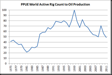
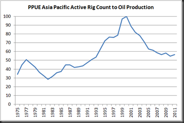
I have standardised the PPUE figures below so that they can be easily compared across all regions. The basic calculation is simply to divide the production figure (thousands of barrels per day) by the corresponding unit of effort for each year. This is then standardised by dividing each figure by the largest figure in the data set and then multiplying by 100 to assign a ranking of 1 to 100. A PPUE of 100 represents a minimal amount of effort for the maximum amount of production while a PPUE of 1 represents a large amount of effort for minimal production. Obviously it is in the best interests of oil producing nations to be at the upper end of this scale. From what I have calculated below this is by and large not the case. The majority of regions around the world are facing falling PPUE which signals one thing: oil is getting harder and harder to get out of the ground. If this is indeed the case then high oil prices are here to stay and will only continue rising in the future.

The Global Outlook

By taking oil production figures from the 2012 BP Statistical Review (includes crude oil, shale oil, oil sands and NGLs) along with international active rig counts from Baker Hughes and calculating the PPUE we can compare how each region is faring.

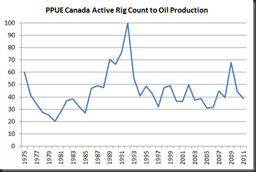
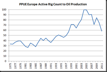
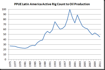
We can see that PPUE for most regions peaked around 2000. The big exceptions being Canada in 1992 and Europe and Africa in the mid 2000s. What this means for the majority of the world is that in little over ten years the average number of barrels of oil a single rig produces has almost halved. Put another way oil companies have had to double the number of rigs in operation just to maintain oil production at 2000 levels. This is the very definition of drilling faster just to stay still.


Region

PPUE 100 Year

PPUE 2011

Years Between

Decline in PPUE

Africa

2005

57

6

43

Asia Pacific

2000

57

11

43

Canada

1992

39

19

61

Europe

2004

58

7

42

Latin America

1999

45

12

55

Middle East

1999

59

12

41

US

1999

34

12

66

World

1999

49

12

51

World PPUE has dropped almost 50% since 1999 after a steady climb from 1981 up to 1999. Despite huge investment individual wells are on average producing less oil.

image

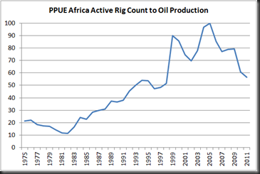
Africa is past peak PPUE.

image

Asia Pacific is past peak PPUE.

image

Canada is past peak PPUE. It appears that after Canada’s peak PPUE in 1991 it plateaued and bounced around the 40-50 mark for most of the last 20 years. The increase in PPUE in the late 2000s can somewhat be explained by the Athabasca tar sands ramping up production since 2003. Roughly half of Canadian oil production now comes from tar sands oil.

image

Europe is past peak PPUE.

image

Latin America is past peak PPUE.

image

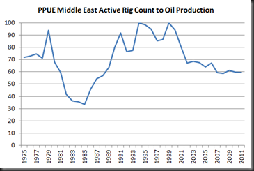
The Middle East is past peak PPUE. The dip from 1979 onwards can be attributed to the Iranian Revolution which severely disrupted global oil prices. OPEC countries made huge profits by reducing production and keeping the price of oil high during this period.

image

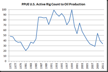
The U.S. is past peak PPUE. The massive rise in the PPUE from 1981 onwards is the other side of the coin showing the impact of the Iranian Revolution. We see a short term rise in PPUE after the global financial crisis but this gain appears to largely now have been lost.

image

An American Case Study

If we then look specifically at U.S. data (because it’s the easiest to find) we get similar results no matter which unit of effort is chosen.

All oil production figures are from the BP Statistical Review of World Energy 2012.

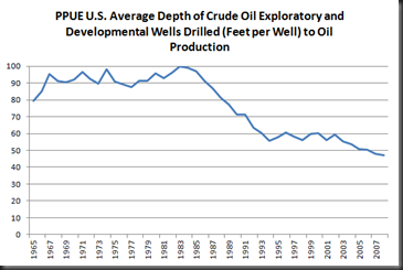
The average depth of wells is getting deeper and yet greater oil production is not reflected by this increase in effort.

image

U.S. Average Depth of Crude Oil Exploratory and Developmental Wells Drilled from EIA.

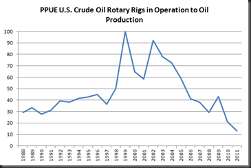
The increased number of crude oil rotary rigs in operation has not helped oil production either.

image

U.S Crude Oil Rotary Rig counts from EIA

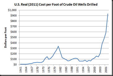
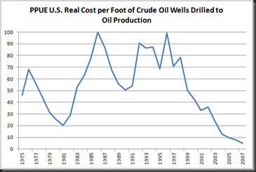
The two graphs below both essentially show the same picture. The cost of drilling per foot has skyrocketed since 2000 driving up the cost of each individual well. Unfortunately the EIA data cuts off at 2007 so we can’t see the impact of the global financial crisis. If well costs are anything like production levels it is likely that the cost fell considerably after 2007 and then climbed back up to to pre-GFC levels.

image

image

Cost of crude oil wells from EIA.  Converted to real 2011 using GDP Deflator figures from World Bank.

When the above two graphs are converted to a standardised PPUE we see the same trend as other all other metrics. As costs per well and per foot drilled have continued upwards production has not followed suit.

image

image

Potential Issues With PPUE

Now it may be that I have missed something fundamental and PPUE is completely useless as an analytical tool. Or it may be that it just needs a tweaking of inputs. No doubt there are some harvest management experts out there that can point out where I have gone wrong. I have outlined a few issues I have identified below that I have some doubts about.

  • PPUE has not been standardised appropriately.
  • PPUE does not represent increases in effort accurately
  • PPUE data cannot generally provide information needed to assess resource management
  • PPUE is inappropriate to assess peak oil

I in no way think PPUE represents the whole picture but see it as supplementing other methods already out there such as EROEI. I welcome comments and criticisms.

For deeper reading on issues surrounding CPUE there are two excellent papers here and here.

Older Posts Home