Trillions of dollars worth of oil found in Australian outbackUp to 233 billion barrels of oil has been discovered in the Australian outback that could be worth trillions of dollars, in a find that could turn the region into a new Saudi Arabia.$20 trillion shale oil find surrounding Coober Pedy 'can fuel Australia'
Oil discovery in Australia’s outback could ‘transform world’s oil industry’
Andrew McKay writing on resource limits, energy, environment, peak oil and peak everything from a New Zealand perspective
Thursday, April 4, 2013
5 Reasons Why Oil Companies Get Away With Overblown Field Estimates
Friday, March 22, 2013
Energy Literacy 101 – 40 Terms To Help You Become An Energy Expert
Low = condensate
Intermediate = natural gas
High = liquefied petroleum gas
Wednesday, February 20, 2013
Oil Consumption & GDP Growth
The economy is getter better, isn’t it? It seems that no matter how hard the New Zealand government tries to convince us there are a range of statistics released from it’s own departments that pour cold water on the notion of any kind of strong economic recovery. Unemployment hitting the highest rate in 12 years is just one of those statistics.
So what does this really mean for the future?
Chris Martenson from Peak Prosperity recently wrote a great article called The Real Reason the Economy Is Broken (and Will Stay That Way). He referenced Gail Tverberg’s work on investment sinkholes and the link between oil consumption and GDP.
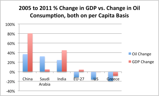
Figure 1: Comparison of 2005 to 2011 percent change in real GDP vs percent change in oil consumption, both on a per capita basis. (GDP per capita on a PPP basis from World Bank, oil consumption from BP’s 2012 Statistical Review of World Energy.) Source
Martenson explains:
Oil and GDP are highly correlated and always have been. The general observation is that growth in GDP is usually higher than growth in oil consumption - as growth in oil consumption powers economic growth. Without growth in oil consumption, GDP growth doesn't advance.
So if we run some similar numbers for New Zealand how do we fare, given our high oil consumption per capita (38th in the world) and reliance on primary industries as the basis of our economy?
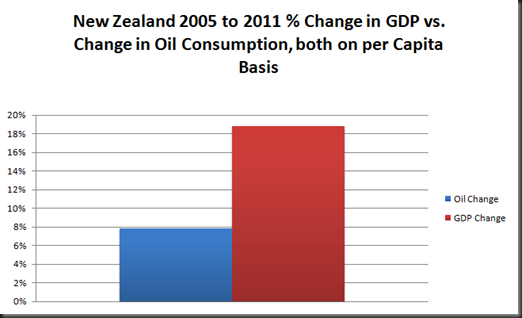 Figure 2: Comparison of 2005 to 2011 percent change in real GDP vs percent change in daily oil consumption, both on a per capita basis. (GDP per capita on a PPP basis from World Bank, oil consumption from BP’s 2012 Statistical Review of World Energy, NZ population data from Statistics New Zealand.)
Martenson:
Back in 2009, in a piece entitled Oil - The Coming Supply Crunch (Part I), I calculated that every 1% increase in global GDP was associated with a 0.25% increase in oil consumption – in other words, a roughly 4:1 ratio.
Based on Figure 2 the ratio for New Zealand over this period is a 0.6% increase in GDP associated with a 0.25% increase in oil consumption which falls well below the global average.
That being said, compared to the Eurozone and the United States the New Zealand economy hasn’t fared too badly. While there has still been economic contraction and rising unemployment we are still a lot better off than our foreign neighbours. Figure 2 shows that GDP per capita rose just shy of 19 percent over the 2005-2011 period while oil consumption has risen just under eight percent. One of the New Zealand’s economies saving graces has been the 2008 free trade deal with China. Exports to China rose $1.5 billion (37 percent) in 2010.
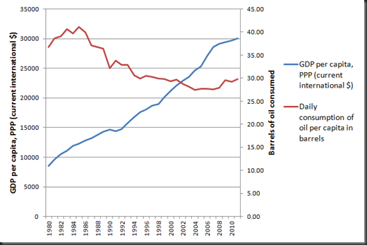
Figure 3: New Zealand GDP per capita vs. daily consumption of oil per capita. (GDP per capita on a PPP basis from World Bank, oil consumption from BP’s 2012 Statistical Review of World Energy, NZ population data from Statistics New Zealand.)
Figure 3 shows we have seen GDP per capita rising steadily for the last 30 years with a flattening off after the global financial crisis. Over this period we also see the consumption of oil per capita peak during the consumerist decade of the 80s and then more or less decline.
Martenson:
Since 2007, something quite remarkable has happened in the world of oil, and that has been a decline in the consumption of oil in the U.S. and Europe -- with China and India pretty much making up the difference for everything that the West didn't consume.
New Zealand’s oil consumption per capita has actually increased from 2007, most probably due to growth in fossil fuel reliant primary industries. But before that period GDP steadily grew while oil consumption steadily fell. How do we reconcile that with Chris Martenson’s view that “without growth in oil consumption, GDP growth doesn't advance.”?
As with most things economic it’s not quite that simple. Gail Tverberg explains further:
In Figure 1, we see that for several groupings, the increase (or decrease) in oil consumption tends to correlate with the increase (or decrease) in GDP. The usual pattern is that GDP growth is a little greater than oil consumption growth. This happens because of changes of various sorts: (a) Increasing substitution of other energy sources for oil, (b) Increased efficiency in using oil, and (c) A changing GDP mix away from producing goods, and toward producing services, leading to a proportionately lower need for oil and other energy products.
The situation is strikingly different for Saudi Arabia, however. A huge increase in oil consumption (Figure 1)…does not seem to result in a corresponding rise in GDP.
New Zealand matches up with both (a) and (b) causing per capita oil consumption to decrease. However given our export based economy, (c) does not ring true at all. Most of our economic growth has come from an intensification of farming practices (mainly dairy), more efficient forestry practices and a large increase in crude oil exports. This coupled with new markets such as China has been a great benefit to New Zealand.
The trouble is when we are so reliant on other countries economies being strong we are incredibly vulnerable when they weaken. There is already murmurs that the commodity boom in Australia is on shaky ground and that the aging population of China spells real trouble when a huge proportion of the population can’t work and needs to be supported. If we want to know how New Zealand economy will do in the future these are the two key countries to watch.
So while we might be doing ok for now, unless our current trading partners perform miracles and stay strong for the foreseeable future don’t expect the New Zealand economy to get much better than this.
Thursday, August 30, 2012
Don't Worry, There's Plenty of Oil
Reposted from Energy Bulletin. By Richard Heinberg.

In recent months we've seen a spate of articles, reports, and op-eds claiming that peak oil is a worry of the past thanks to so-called "new technologies" that can tap massive amounts of previously inaccessible stores of "unconventional" oil. "Don't worry, drive on," we're told.
But as Post Carbon Institute Senior Fellow Richard Heinberg asks in this short video, what's really new here? "What's new is high oil prices and … the economy hates high oil prices."
WE NEED YOUR HELP SHARING THIS VIDEO
- Email the video to everyone you think needs to watch it
- Share it through your social networks
- Send it to your elected officials
We can fall for the oil industry hype and keep ourselves chained to a resource that's depleting and comes with ever increasing economic and environmental costs, or we can recognize that the days of cheap and abundant oil (not to mention coal and natural gas) are over.
Unfortunately, the mainstream media and politicians on both sides of the aisle are parroting the hype, claiming — in Obama's case — that unconventional oil can play a key role in an "all of the above" energy strategy and — in Romney's — that increased production of tight oil and tar sands can make North America energy independent by the end of his second term.
We need your help: Please share this video and help bring a dose of reality to the energy conversation.
The Script
Our civilization runs on oil.
It’s the cheapest, most energy-dense and portable fuel we've ever found. Nature required tens of millions of years to make petroleum, and we've used up the best of it in less than two hundred.
A little over a decade ago, eminent petroleum geologists calculated that global oil production would soon hit a “peak” and begin to decline, no longer meeting ever-rising demand. But oil industry spokesmen countered with the message, "Don't worry, there's plenty of oil!" and assured us that everything would be just fine.
So what actually happened? World crude oil production flat-lined in 2005, and oil prices went crazy. Wars erupted in the oil-rich parts of the world, and the global economy went into a tailspin. The term "Peak Oil" entered the lexicon.
The oil industry is now staging another PR counter-offensive. They're telling us that applying "new" technologies like hydrofracking to low-porosity rocks makes lots of lower quality, unconventional oil available. They argue we just need to drill more to produce more. Problem solved!
But wait. What's actually new here? Most of this technology has been around since the 1980s. The unconventional resources have been known to geologists for decades. What's new is high oil prices.
It’s high oil prices that make unconventional oil worth producing in the first place. It takes lots of money and energy, not to mention water, to frack low-porosity rocks. And the environmental risks are staggering.
How does the economy handle high oil prices? Well, it turns out the economy hates high oil prices and responds by going into recession. Which makes energy prices volatile, rendering the industry subject to booms and busts.
So, what’s the bottom line here?
Yes, there's still oil in the ground. We just can't afford it. In broad terms, the peak oil analysts were right. But the fossil fuel industry is winning the PR battle.
What really matters, though, is not who wins the debate, but how we prepare for the inevitable. We’ve got to wean ourselves off our high-energy lifestyle.
We'd be foolish to wait for events to settle the debate once and for all. Let's say goodbye to oil. It's saying goodbye to us.
WE NEED YOUR HELP SHARING THIS VIDEO
- Email the video to everyone you think needs to watch it
- Share it through your social networks
- Send it to your elected officials
Wednesday, August 22, 2012
Mind the Gap: The Difference Between Brent and WTI
There is much talk in the media about “oil prices” especially when it begins to hurt consumers at the fuel pump. Prices are sometimes referred to as Brent crude or West Texas Intermediate (WTI) or sometimes just as oil. So what does this all mean and what are the differences?
Brent crude is sweet light oil sourced from fifteen fields in the North Sea. “Sweet” refers to the sulphur content. The lower the sulphur content the easier it is to refine. “Light” refers to the ability of the oil to flow freely which makes it easier to transport and refine. In comparison oil from the Alberta tar sands is considered to be heavy as it is transported as diluted bitumen (dilbit) and is much more difficult to refine. WTI is lighter and sweeter than Brent with a sulphur content of 0.24% compared to 0.37%. WTI is sourced from around North America and priced from the trading hub of Cushing, Oklahoma.
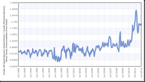
Figure 1: Monthly ratio of the nominal price of Crude Oil (petroleum); Dated Brent divided by the price of West Texas Intermediate. From Indexmundi.
Historically Brent prices lagged behind WTI until Brent began selling for more than WTI in the early 2000s for the first time. Since then Brent has gradually pulled away from WTI and was trading at a US$17.81 premium at the time of writing.
Goldman Sachs expects WTI to close the gap with Brent in the near future as shipments into Cushing slow, decreasing supply. This does not bode well for global oil prices with Goldman Sachs also predicting that Brent will reach US$120 in the next three months due to field maintenance in the North Sea and European market optimism.
Traditionally WTI has been used as the international benchmark for oil prices but over the last few years Brent has overtaken WTI in importance. This is backed by a 2007 report from the now defunct Lehman Brothers that WTI was no longer a gauge for the international oil market. As Cushing is landlocked it is restricted by pipeline capacity which has led to an supply glut over the past few years. WTI is not traded in any significant quantity outside North America.
Steve Austin at OilPrice.com: “Brent is the real international benchmark.Two-thirds of the oil consumed in the US is Brent, and two-thirds of international crude is priced to it. Still the media and market persist in quoting WTI, rather. This is a US singularity, like the non-adoption of the metric system.”
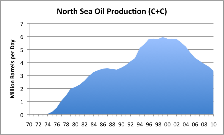
Figure 2: Oil production from the North Sea, based on EIA data. From Our Finite World.
North Sea oil production peaked in 1999. Even with record high oil prices since 2007 production has not been turned around. Oil companies have been in dispute with the British government over tax rates since 2011, responding by cutting production by 18% which lead to a £2.3bn drop in tax revenues. Since a government u-turn on the tax arrangement, investment in the North Sea is expected to increase from £8.5bn last year to £11.5bn this year.
This decreased output from the North Sea has raised grumblings that Brent is no longer a true indicator of global supply and demand either. But there is currently no viable alternative and so it looks as though Brent is set to stay as the global benchmark for sometime to come.
Saturday, August 18, 2012
Running on Empty: Big Airlines in Big Trouble
I have a joke with a friend of mine that airline pilots are nothing but glorified bus drivers. As cynical as this may be, for the majority of us with regular jobs who fly economy air travel is increasingly becoming like its land-based cousin: cramped, overcrowded and at times downright unpleasant.
Most people living in our modern industrial society take air travel for granted. We think very little about hopping on a plane and travelling around the world for little more than a couple of weeks wages. As jet fuel prices bounce along with the price of crude however many airlines are increasingly struggling to break even. Fuel prices now account for 35 percent of operating costs compared to 15 percent a decade ago. Air travel has always been a fickle business, earning an average net profit of one to two percent, compared with an average of over five percent for U.S. industry as a whole. Research from the 1980s found that some carriers would have zero profitability if they had lost just one out of ten business passengers.
So how does the future look for the airline industry? If recent trends are anything to go by, not good. Not good at all.
Plane TrendsAirlines have increasingly been moving towards smaller aircraft despite the popularity of the “Superjumbo” Airbus A380 since its release in 2007. Airbus has sold 253 A380s while Boeing has orders for 106 747-8s with the large majority of these being used for cargo operations. Richard Aboulafia from Teal Group, an Aerospace and Defense Market Analysis company believes that smaller, sleeker aircraft are the future of international air travel ““The market for large aircraft in general is disappearing fast. Most of the 747-8 planes are cargo. There’s just a limited market.”
Packed Like Sardines
In an effort to increase profits from each flight a number of airline companies are trying to fit more passengers onto each plane. The sale of an extra one or two seats can mean the difference between breaking even and a loss. While standing room only flights appear to be nothing other than a cheap marketing ploy companies have reduced the seat width in order to fit an extra seat in each row.
Air New Zealand recently replaced its older 747s with a significantly narrower 777-300ER. To accommodate the same 3-4-3 seat configuration the new seats are one inch narrower and the aisle has decreased in size as well. Air New Zealand was named the most innovative airline in the world last year Airlinetrends.com and so it is likely that other airline companies will follow suit.
In 2010 an Italian company, Avio Interiors, introduced the world to its “Skyrider” saddle-style seat. Intended for up to four hour long flights the passenger sits at an angle with 23 inches of legroom (compared with 30 inches on a standard configuration) allowing more passengers per flight. Two years later no airlines have yet committed to the Skyrider seating but as fuel prices continue to rise one has to wonder how long it will take before it is seriously considered.
At the other end of the spectrum some airlines have introduced what has colloquially been termed “chub class.” In an effort to accommodate the expanding waistline of Western flyers Airbus is increasing the size of aisle seats to 20 inches wide on its A320 jets while decreasing middle and window seats by one inch. The premium wide seat will be sold at for an extra US$10.
Weight Reduction
Scoot Airlines, based out of Singapore has recently removed television monitors from airplane seats replacing them with Apple iPads. The television monitors and associated electronics are reported to weigh two metric tonnes. According to Bloomberg this has enabled the airline to add 40 percent more seating while decreasing the weight of a fully loaded flight by seven percent.
Extra Charges Everywhere
Traditionally the most successful airlines traded on glamour and providing a service experience. Recent trends however show that airlines are increasingly moving towards a no-frills approach in an effort to cut expenses. To do this airlines are imposing costs on everything possible under the thin veil of “increased consumer choice.” Changes seen over the last few years include the removal of a complimentary item of check-in luggage, the removal of complimentary meals and extra charges for window seats and seats towards the front of the plane. The iPads on Scoot flights mentioned above will cost US$17 to hire for the flight.
Recommendations from a 2005 study suggest that a low-cost strategy should no longer be considered an exception but should rather become the norm for the airline industry. We can see this recommendation playing out today with the stripping of services from flights shifting to an almost purely user pays model.
Case Study: The Air New Zealand Situation
A good example of this new user pays model is Air New Zealand. In 2010 they changed to single class short haul flights with radically rebundled fares. Travellers can now choose from one of four options beginning with a seat, one 7kg carry-on bag, tea, coffee and water and access to some entertainment options but no new release entertainment. At the other end they have the ‘Works Deluxe’ which allows two priority bags, a carry-on bag, meal and drinks, a seat request, a guaranteed empty seat next to the passenger, premium check in, lounge access and better entertainment options.
Being the most innovative airline company does not necessarily make you the most profitable. Air New Zealand announced a 71 percent earning slump in February 2012. As part of its recovery plan the company announced it was cutting 441 jobs. The airline blamed a decrease in passenger numbers as well as as fuel costs NZ$173 million more than forecast. This is despite the airline enjoying “a solid performance from the domestic network including benefits from the Rugby World Cup and improved market share on the Tasman” according to Air New Zealand chairman, John Palmer.
The outgoing chief executive Rob Fyfe says the price of jet fuel has doubled over the last three years and due to the weak global economy it has been difficult to pass on the higher costs to passengers.The inflation adjusted average price of jet fuel was US$3.04 per gallon for the six months to December 31st. Going off jet fuel prices alone it is unlikely the airline will see much of a turn around in profitability for 2012. In the first six months of 2012 the average price barely moved, up US$0.04 to $US3.08.
The full year earnings are not released until the end of August but the few media releases coming out of Air New Zealand the last few months are beginning to sound increasingly desperate. On 19th July 2012 Fyfe and Palmer called for an “urgent review” of New Zealand tourism. Palmer told Parliament's finance and expenditure committee that despite operational improvements (newspeak for job cuts), Air New Zealand's financial performance was not healthy and decreased expenditure was yet to be reflected in its currently "disappointing" share price.
Air New Zealand is looking to focus on its domestic, Australian and Pacific service as these have been the most economically sustainable. According to Fyfe, "An aircraft flying to London and back, a 777-300, it costs $1.25 million to get that aircraft to London and back and over 50% of the cost of fuel, a 737 flying to Auckland - Wellington about 23% of the cost is fuel."
The Global Situation
Globally the situation does not look much better. Some Middle Eastern airlines and Asian carriers are still recording strong growth but they are the exception. The International Air Transport Association (IATA) revised the Middle Eastern profit forecast in March 2012 from USD300 million to USD500 million assuming jet fuel prices stay stable. A spike in oil prices could however could turn the forecast profit into a USD200 million loss for the region’s airlines. According to the IATA average oil prices could reach as high as US$135 per barrel this year in the unlikely event of Iran closing the Strait of Hormuz. Oil prices this high would create a US$5.3billion loss for the global aviation industry.
U.S. airline profits have historically followed a cyclical profit-loss pattern of three to five years since U.S. deregulation in 1978. Profit margins have always been thin, sitting at 1.6% during the 1980s and only 1.0% for the period between 1990 and 2000. The early 2000s however saw economic downturn accompanied by huge industry-wide losses of $7 billion in 2001, $7.5 billion in 2002, and $5.3 billion in 2003. The impact of 9/11 and the associated changes to the way airlines run as well as the Dot-com crash cannot be denied either. Between 2000 and 2005 the industry plunged into record operating losses of $40 billion in total.
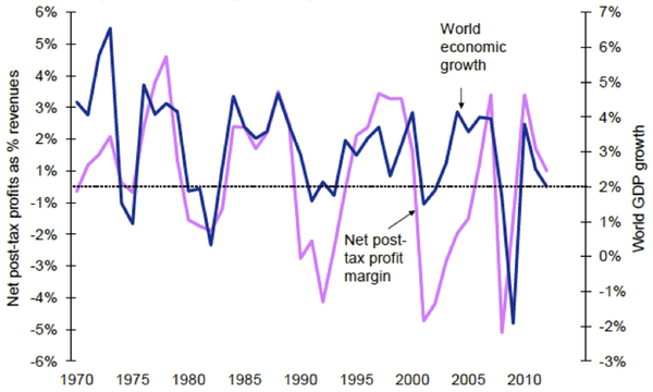
Figure 1: World economic growth and airline profit margins: 1970 to 2011. Source: IATA Financial Monitor for Jan/Feb-2012 released on 01-Mar-2012, sourcing IATA, ICAO & Haver.
Figure 1 clearly illustrates the cyclical nature of the airline industry. Whenever world GDP growth drops below two percent this is reflected by the net post-tax profit margin turning negative.
The director general and CEO of IATA, Tony Tyler, has cautioned that global GDP is not expected to pass two percent in 2012. “The risk of a worsening Eurozone crisis has been replaced by an equally toxic risk – rising oil prices. Already the damage is being felt with a downgrade in industry profits to $3.0 billion… With GDP growth projections now at 2.0%...it will not take much of a shock to push the industry into the red for 2012,” Mr Tyler said.
Rising fuel costs have taken a massive chunk out of the airline industries profit margins. The cost of jet fuel closely maps that of crude oil prices. This means that when prices are high at the local pump the airline companies are also hurting.
The IATA has forecast the airline 2012 fuel bill is expected to be $US213 billion, equivalent to 34 percent of total operating costs. The IATA fuel price average for 2012 is currently $US128.6 per barrel which is estimated to add an extra $US31billion onto the forecast 2012 jet fuel bill.
These IATA forecasts illustrate the fragility of the airline industry. Profitability is an elusive prospect for the industry with the IATA commenting that “the best collective margin of the last decade of 2.9% (2007 and 2010) does not cover the cost of capital”. Cargo traffic around the globe declined 1.9 percent in May 2012 compared to May last year. Cargo traffic generated US$66 billion in 2010 but has declined every month since May 2011. “Business and consumer confidence are falling,” Tyler said. “And we are seeing the first signs of that in slowing demand and softer load factors. This does not bode well for industry profitability.”
Dirty Air
If airlines are struggling this much with the current economic conditions it is almost certain that a globally unified approach to carbon taxing would cripple the industry. A report from 2008 found that airlines were emitting 20 percent more carbon dioxide than previously estimated. This could grow to 1.5 billion tons a year by 2025, far more that the worst cast IPCC predictions. As a comparison the entire European Union currently emits 3.1 billion tons of CO2 annually. This emission prediction does assume that oil prices will stay relatively low and that economic growth gets back on track, two assumptions that are looking increasingly unlikely.
Travel While You Can
Environmental concerns aside if you want to travel anywhere in the next five years now is the time to do it. The global economy is extremely fragile at the moment. Petroleum deliveries are at their lowest point since September 2008, with the weakest July demand since 2005 and yet Brent crude prices are still sitting above $US116 per barrel. This is not to mention the impending US “fiscal cliff” where $600bn in tax increases and spending cuts come into effect on January 1, 2013. Unless the US Congress comes to some kind of agreement on raising the debt ceiling again by the end of this year GDP growth could be reduced by four percent, plunging the US into recession. Europe is cannot escape its current quaqmire without huge upheaval and there is now talk that France will be the next to crumble leaving Germany on its own. China’s growth has slowed to a three year low of 7.6 per cent with little sign of recovery in the next few months.
This is all bad news for airlines that are already combatting high fuel prices. I expect to see a number of big name airlines fold or amalgamate in the next two years as financiers can no longer afford to prop up an industry that is hemorrhaging with no relief in sight. This could mean a reduced number of flights, less options of places to travel and skyrocketing ticket prices. While mother nature might thank us for the reduction in emissions the airline industry is running on empty.
Monday, August 13, 2012
Update - The New Paradigm: Volatile Oil Markets
It was kindly pointed out to me last week by erich, a commenter on my article at Energy Bulletin that the data set I had used had not been adjusted for inflation. I had originally argued that it shouldn’t make much difference. I thought that as I was dealing with the price changes within a year and as the ANOVA treats each year as a separate group the effect of inflation would be negligible. However after thinking about it for a while I decided it would be worthwhile to run the inflation adjusted numbers to remove any doubt on the conclusions I had drawn from the original data set. Using this consumer price index (CPI) information I adjusted my original data set to 2010 dollars and reran the ANOVA.

Figure 1: Statistically significant Bonferroni-Holm test results looking at the difference between years in the monthly change in price for crude oil (US dollars per barrel), simple average of three spot prices; Dated Brent, West Texas Intermediate, and the Dubai Fateh, August 1982-June 2012. Data from http://www.indexmundi.com/commodities/?commodity=crude-oil
Figure 1 shows there were less results rejecting the null hypothesis, 32 compared to 59 in the unadjusted data which goes to prove erich’s point that at least some of the effect I was seeing was due to inflation. I feel somewhat vindicated at the same time that my original conclusions still stand. As erich said in his comments after I shared the new results “Adjusting prices for inflation makes your analysis and conclusions more robust and defensible” and so I thank erich for first raising the issue in a polite and encouraging manner.
I also tracked down some more oil price data sets that I hadn’t come across before and I was excited to see if my hypothesis, that oil volatility has significantly increased since conventional oil production plateaued in 2005, could be replicated.
This morning I came across an article on the 2012 United States Presidential “Energy Election” at a blog called Con Carlitos, written by Calvin Sloan. He had an interesting footnote which explained something I had not quite grasped and I will quote here in full:
As noted by Steve Austin at OilPrice.com: “Brent is the real international benchmark.Two-thirds of the oil consumed in the US is Brent, and two-thirds of international crude is priced to it. (Brent crude is sourced from fifteen oil fields in the North Sea.) Still the media and market persist in quoting WTI, rather. This is a US singularity, like the non-adoption of the metric system.”
Due to this I decided to look specifically at Brent crude prices as the strongest conclusions can be made from that data. I looked at both monthly and weekly Brent Crude prices between May 1987 and June 2012. Using average annual CPI data from the U.S. Bureau of Labor Statistics I adjusted the monthly and weekly Brent crude prices to 2012 dollars .
The monthly data returned only four results rejecting the null hypothesis. 2008 was significantly different to 1993, 1994 and 1995 and 2011 was significantly different to 1995. I was surprised this result was so low and intrigued to see if the weekly data was any different.

Figure 2: Statistically significant Bonferroni-Holm test results for weekly Brent crude prices May 1987 to June 2012.
It would appear from Figure 2 that the monthly effect was largely masking the difference in Brent price volatility between years. When looked at on a weekly level we see that 76% of the statistically significant results occur after the 2005 production plateau.
It can be concluded that while oil prices may be highly volatile on a week to week basis the effect is reduced on a monthly basis. We can also conclude that post 2005 we have seen a marked increase in weekly oil price volatility. The first six months of 2012 data is the fourth (equal with 2010) most volatile year for oil prices in the last twenty-five years behind only 2011, 2009 and 2008. The data from July and August 2012 was not included in this data set but it is my guess they would push 2012 further up the ranks. It is even possible by the end of the year that 2012 could be the second most volatile year after 2008. I for one will be watching oil prices over the next few months with great interest to see if the great yo-yoing continues.